Tutor Orial
Tutor Orial
Tutor Orial
Tutor Orial
Redesigning the sign-up flow for a tutoring website to improve form completion rates -> retain customers
Redesigning the sign-up flow for a tutoring website to improve form completion rates -> retain customers
Redesigning the sign-up flow for a tutoring website to improve form completion rates -> retain customers
Redesigning the sign-up flow for a tutoring website to improve form completion rates -> retain customers
ROLE
ROLE
ROLE
Product Designer &
Researcher
Product Designer &
Researcher
Product Design
UX Design
TIMELINE
TIMELINE
2023
2023
SKILLS
SKILLS
SKILLS
UX Research
Usability Testing
Web Design
UX Research
Usability Testing
Web Design
UX Research
Usability Testing
Web Design
TOOLS
TOOLS
TOOLS
Figma
Dovetail
Figma
Dovetail
Figma
Dovetail
THE CONTEXT
THE CONTEXT
Tutor orial is a tutoring agency for high school students. They were facing challenges with retaining their clients due to the overall user experience of their website, and hence losing business.
Tutor orial is a tutoring agency for high school students. They were facing challenges with retaining their clients due to the overall user experience of their website, and hence losing business.
Tutor orial is a tutoring agency for high school students. They were facing challenges with retaining their clients due to the overall user experience of their website, and hence losing business.
Tutor orial is a tutoring agency for high school students. They were facing challenges with retaining their clients due to the overall user experience of their website, and hence losing business.
WEBSITE EVALUATION
WEBSITE EVALUATION
Analyzing the main issues through a heuristic evaluation
Analyzing the main issues through a heuristic evaluation
Analyzing the main issues through a heuristic evaluation
Analyzing the main issues through a heuristic evaluation
This assessment enabled me to prioritize key problems, given the timeframe for the redesign.
This assessment enabled me to prioritize key problems, given the timeframe for the redesign.
This assessment enabled me to prioritize key problems, given the timeframe for the redesign.
This assessment enabled me to prioritize key problems, given the timeframe for the redesign.
DISCOVERY
DISCOVERY
Key reasons students would abandon the site:
Key reasons students would abandon the site:
Key reasons students would abandon the site:
Key reasons students would abandon the site:
Upon analysis, I identified the top three priorities for improvement that need immediate attention:
Upon analysis, I identified the top three priorities for improvement that need immediate attention:
Upon analysis, I identified the top three priorities for improvement that need immediate attention:
Upon analysis, I identified the top three priorities for improvement that need immediate attention:
No Visibility Of System Status
No Visibility Of System Status
No Visibility Of System Status
USERS LACK CLARITY & REAL TIME FEEDBACK
USERS LACK CLARITY & REAL TIME FEEDBACK
USERS LACK CLARITY & REAL TIME FEEDBACK
Limited Flexibility of Use
Limited Flexibility of Use
Limited Flexibility of Use
PROLONGED PROCESSING TIME & LIMITED CHOICES
PROLONGED PROCESSING TIME & LIMITED CHOICES
PROLONGED PROCESSING TIME & LIMITED CHOICES
Lack of Design Aesthetic
Lack of Design Aesthetic
Lack of Design Aesthetic
COLORS,COPY & FONTS CAUSE LACK OF TRUST
COLORS,COPY & FONTS CAUSE LACK OF TRUST
COLORS,COPY & FONTS CAUSE LACK OF TRUST
THE IDEA
THE IDEA
The sign-up form is long and extensive, would breaking this into smaller, optional sections increase completion rates?
The sign-up form is long and extensive, would breaking this into smaller, optional sections increase completion rates?
The sign-up form is long and extensive, would breaking this into smaller, optional sections increase completion rates?
The sign-up form is long and extensive, would breaking this into smaller, optional sections increase completion rates?
CURRENT SIGN UP FORM
CURRENT SIGN UP FORM
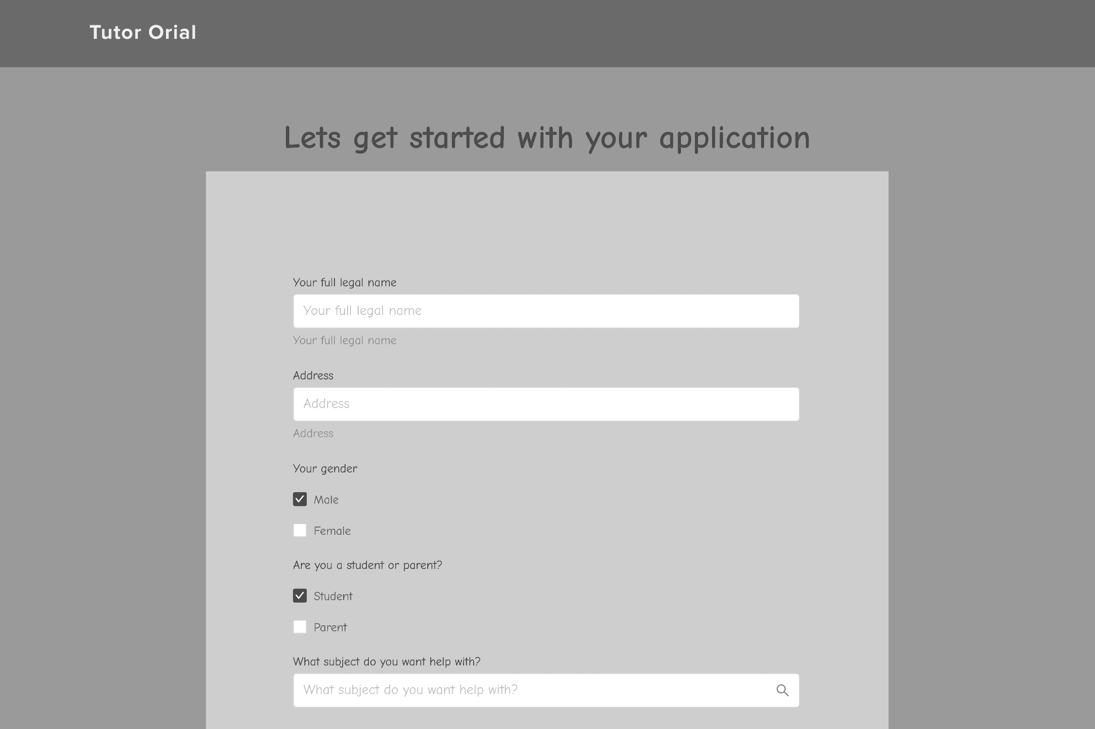


CURRENT SIGN UP FORM
CURRENT SIGN UP FORM


↓
→
SO... THROUGH TESTING
SO... THROUGH TESTING
The students feel the bitesize form saves time, but there is still a lack of flexibility
The students feel the bitesize form saves time, but there is still a lack of flexibility
The students feel the bitesize form saves time, but there is still a lack of flexibility
The students feel the bitesize form saves time, but there is still a lack of flexibility
Through 5 user interviews, I established what was & wasn’t working with the new sign up flow:
Through 5 user interviews, I established what was & wasn’t working with the new sign up flow:
Through 5 user interviews, I established what was & wasn’t working with the new sign up flow:
Through 5 user interviews, I established what was & wasn’t working with the new sign up flow:
APPLYING FEEDBACK
APPLYING FEEDBACK
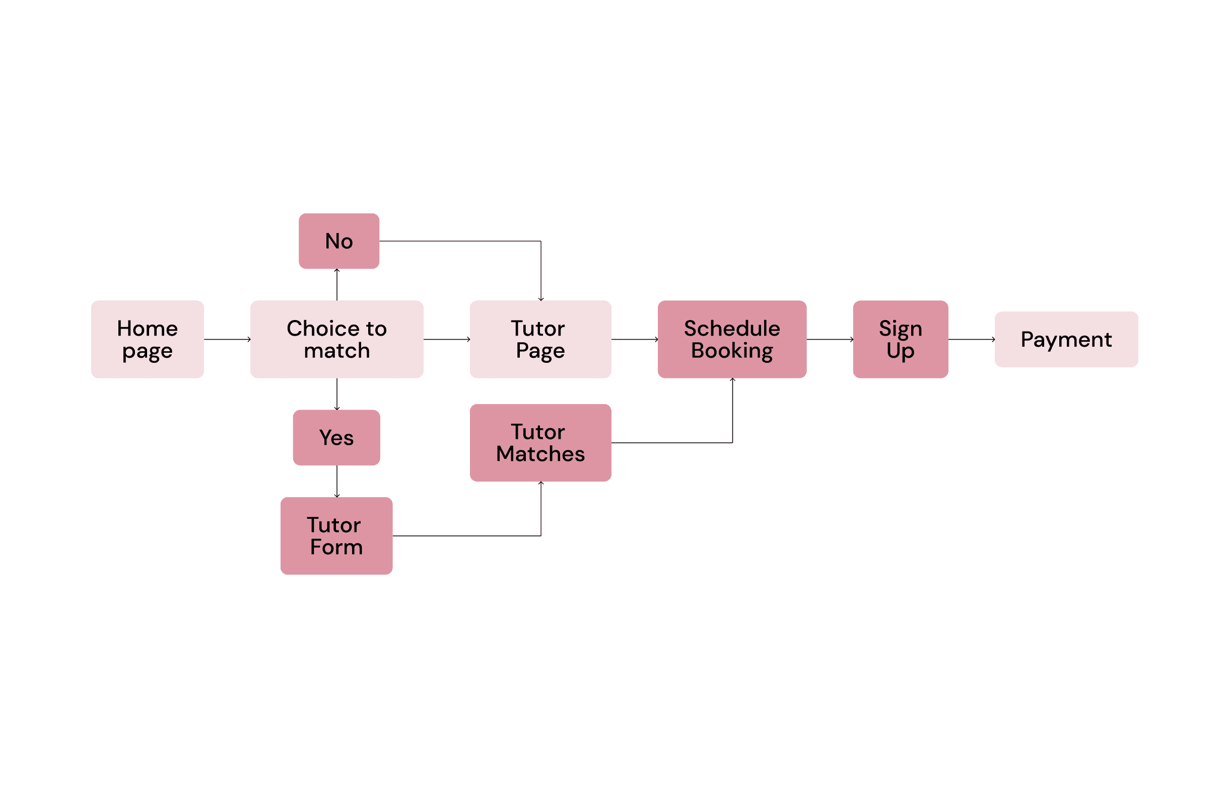
Make filling out the form optional by giving a choice to match with tutor
Make filling out the form optional by giving a choice to match with tutor
Make filling out the form optional by giving a choice to match with tutor
Make filling out the form optional by giving a choice to match with tutor
“What if I want to skip all questions” -> Option to match to tutor, and if not can skip the whole form
”I wouldn’t want to sign up before seeing appointment dates”
-> Schedule appointment then sign up
“What if I want to skip all questions” -> Option to match to tutor, and if not can skip the whole form
”I wouldn’t want to sign up before seeing appointment dates”
-> Schedule appointment then sign up
“What if I want to skip all questions” -> Option to match to tutor, and if not can skip the whole form
”I wouldn’t want to sign up before seeing appointment dates” -> Schedule appointment then sign up
“What if I want to skip all questions” -> Option to match to tutor, and if not can skip the whole form
”I wouldn’t want to sign up before seeing appointment dates”
-> Schedule appointment then sign up


VISUAL IDENTITY
VISUAL IDENTITY
(Mini) Design System
(Mini) Design System
(Mini) Design System
(Mini) Design System
FINAL OVERVIEW
Choose to find a tutor match
Choose to find a tutor match
Choose to find a tutor match
Choose to find a tutor match
When the user gets started, an overlay will popup allowing them to choose whether they want to get matched with a tutor, and subsequently fill out a form.
When the user gets started, an overlay will popup allowing them to choose whether they want to get matched with a tutor, and subsequently fill out a form.
When the user gets started, an overlay will popup allowing them to choose whether they want to get matched with a tutor, and subsequently fill out a form.
When the user gets started, an overlay will popup allowing them to choose whether they want to get matched with a tutor, and subsequently fill out a form.
Filling out the form
Filling out the form
Filling out the form
Filling out the form
Bite-size form design with questions curated to find students the right tutor, with options to skip questions or go back.
Bite-size form design with questions curated to find students the right tutor, with options to skip questions or go back.
Bite-size form design with questions curated to find students the right tutor, with options to skip questions or go back.
Bite-size form design with questions curated to find students the right tutor, with options to skip questions or go back.
Top 3 tutor matches
Top 3 tutor matches
Top 3 tutor matches
Top 3 tutor matches
It provides you with the top 3 tutor matches based on the form’s answers, and the students can favorite a tutor if they like them.
It provides you with the top 3 tutor matches based on the form’s answers, and the students can favorite a tutor if they like them.
It provides you with the top 3 tutor matches based on the form’s answers, and the students can favorite a tutor if they like them.
It provides you with the top 3 tutor matches based on the form’s answers, and the students can favorite a tutor if they like them.
Sign up & payment
Sign up & payment
Sign up & payment
Sign up & payment
Once appointment schedule is selected, students can proceed to sign up & pay.
Once appointment schedule is selected, students can proceed to sign up & pay.
Once appointment schedule is selected, students can proceed to sign up & pay.
Once appointment schedule is selected, students can proceed to sign up & pay.
Next Steps
Next Steps
Next Steps
Next Steps
-> Test with more students & create more consistency within the design system
-> Test with more students & create more consistency within the design system
-> Test with more students & create more consistency within the design system
-> Test with more students & create more consistency within the design system
-> This was my first UI/UX project, learning figma, auto layout, prototyping & creating components! A short time since, but I have come a long way since then!
-> This was my first UI/UX project, learning figma, auto layout, prototyping & creating components! A short time since, but I have come a long way since then!
-> This was my first UI/UX project, learning figma, auto layout, prototyping & creating components! A short time since, but I have come a long way since then!
-> This was my first UI/UX project, learning figma, auto layout, prototyping & creating components! A short time since, but I have come a long way since then!